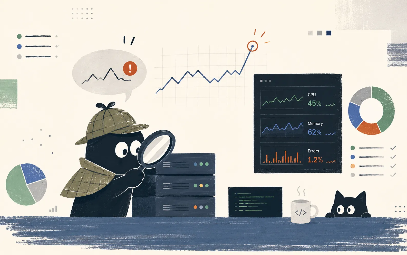
For a server developer, monitoring is something like a lifeline. It has to be, because a server is a time bomb that can go off at any moment. With monitoring in place, you can narrow down the cause quickly when an incident happens, and sometimes catch a problem before it becomes one.
Unfortunately, while there are plenty of guides on installing and building monitoring dashboards, there aren’t many on how to read those dashboards and diagnose problems with them. So a lot of developers feel a vague fear of monitoring. This article aims to be a starting point for getting past that fear, and lays out how to read monitoring and how to act on what you see.
What Matters?
The better a dashboard, the more graphs it has. Add CPU, memory, requests per second, response time, thread pool utilization, and the rest of the metrics you need, and soon there are too many to fit on one page. All of these graphs, though, can be grouped into four categories. Google’s SRE organization calls them the four golden signals.1
- Traffic: how much is coming in?
- Latency: how long does it take?
- Errors: how often do requests fail?
- Saturation: how full are we?
Traffic shows how busy the server is, usually expressed as requests or transactions per second. Latency is the time from a request coming in to the response going out. Errors are the proportion of requests the server failed to process. Saturation shows how much of the server’s resources are in use, through metrics like CPU, memory, thread pools, and connection pools.
Whatever the metric, it belongs to one of these four, and however complex the dashboard, in an incident you can work through it from these four angles. Add one more perspective and you have the foundations of graph reading in place. Metrics divide into those that show symptoms and those that show causes. Latency and error rate are symptoms. They are problems users actually experienced, and when they rise, it is a problem, always. Resource metrics like CPU, memory, and thread pools sit on the cause side. CPU at 90% is not an immediate emergency if responses are fast, and CPU at 20% is a problem if responses are slow. A sustained 90% does mean there is no headroom left, so it needs watching, but it is not a reason to wake someone up at dawn.
So with metrics, you always identify the symptom first, then narrow down the culprit through the causes. Alerts, as a rule, should also be attached to symptoms. A momentary “CPU over 80%” alert often wakes someone at dawn over nothing, but if an “error rate exceeded” alert fires, someone is actually having a problem.
This article follows the same order. First comes the symptom side, learning the usual shape and the anomaly patterns of the traffic, latency, and error graphs. Next comes the cause side, narrowing down the culprit with CPU, memory, and pools. After that come the problems like bottlenecks, backpressure, caches, and timeouts, which only become visible when you read several graphs on top of each other. The last part covers when and how to use all of it.
Reading the User’s Problems
Latency and errors are problems users actually feel, so they are the starting point of every analysis. Strictly speaking, traffic is context rather than a symptom, but it is the basic instrument for reading latency and errors, so it comes first.
Traffic: How Much Is Coming In
The first thing to learn from a traffic graph is the normal shape, before any anomaly patterns. Unless something special is going on, like an attack or an event, a service’s traffic draws nearly the same shape every day. You need that shape memorized to notice an anomaly. If the metric is at half its usual level, something is wrong even if the value sits inside the normal range.
Once you know the normal shape, the anomaly patterns come down to a few. Traffic dropping vertically doesn’t mean the server has gone idle. It means requests are failing to arrive. When something goes wrong in the load balancer, DNS, or a gateway out front, the graphs on the servers behind it look peaceful instead. If every server metric looks clean in the middle of an incident, that itself is the biggest anomaly signal. In the other direction, traffic shooting up vertically can be read as a sudden viral surge, crawler traffic, or an attack. And spikes that rise on a regular schedule in the early morning are almost always batch jobs or cron. If the spikes are regular, suspect an internal job first.
Seeing is believing, so let’s look at the actual shapes. The animation below shows the normal state and three anomaly patterns. Notice how the same traffic graph points you at very different places depending on which way it moves.
The last important thing about the traffic metric is that it can serve as a denominator. The same 500 errors mean very different things at a million requests per minute and at a thousand. Whether it’s errors or slow queries, whenever you look at a count, you have to divide it by traffic and read it as a rate.
Latency: How Long It Takes
Suppose the dashboard’s average response time has been stable at 100ms for days, but complaints keep coming in that the app is too slow. The metric says healthy and the users say problem. Who is lying?
The liar is the average. An average is a total divided by a count, so it erases the shape of the distribution. A server where every request takes around 100ms and a server where most take 30ms but some take 900ms can both average 100ms. That’s why response time should be read in percentiles, not averages. Line up the requests in some window by response time, and the value at the 50% mark is P50, at the 95% mark P95, at the 99% mark P99. Draw the response time distribution as a histogram and you get a long stretch to the right. That stretch looks like a tail, which is why the slow responses around P99 are called tail latency.
The animation below puts those two servers side by side. Requests pile up and build the histograms, and the average line sits at 100ms on both. When the percentile markers appear, it becomes clear that the two are completely different systems.
You might be thinking “it’s 1%, can’t we ignore it?” There are two reasons you shouldn’t. First, once traffic grows even a little, 1% is a big number. At 1,000 requests per second, ten people hit P99 every second. In a day, that’s 860,000 requests. Second, in a modern service where drawing a single screen takes dozens of API calls, the more calls there are, the more the odds multiply that one of them lands in the tail. Even if one request avoids P99 with 99% probability, forty calls all avoid it with 67% probability. One user in three experiences tail latency somewhere on the screen. This is why Google puts the fight against tail latency at the center of system design. What’s more, the users who land in the tail are not random. Heavy, long-time users have more data, so they generate heavier queries and land in the tail more often. P99 is quite possibly the response time your best customers are getting.
So P50 is the representative value for user experience, and P95 or P99 should be the basis for alerts and performance targets. As we’ll see later, the early signs of an incident almost always appear in P99 first. The tail is an early warning that tells you where the weakest part of the system is.
Errors: How Often Requests Fail
When the error rate graph jumps, ask “which errors” before “how many percent.” In HTTP status code terms, 4xx and 5xx are entirely different events. A 5xx means the server failed to process the request, so it is always our problem. A 4xx is, by the spec, a bad request from the client, but that doesn’t mean it can be ignored. If 400s or 401s surge right after a deploy, it’s more likely that we broke the API contract than that every client suddenly went bad. A new app version is talking to an old server, or the other way around. In the end, the 4xx graph asks “whose mistake is this?” while the 5xx graph asks “what of ours is broken?”
After the status code, look at how fast the failures happen. Requests that fail by timeout fail slowly. They hold a thread and a connection for seconds before giving up, so they cause error and saturation problems at the same time. On the other hand, connection refusals from a dependency that is outright down, or code bugs like null references, fail immediately. They return a 5xx within milliseconds, so resources are freed up instead. Reading the error rate and P99 together therefore tells you the kind of failure you have. If the error rate and P99 rise together, something is slowing down and dying. If the error rate spikes while P99 stays fine, something is failing instantly.
There are even cases where latency metrics improve while the error rate climbs. In the animation below, watch which direction the error rate and P99 each move at the moment the incident begins.
Requests that fail immediately either leave the latency distribution or blend in as millisecond samples, so the worse the incident gets, the better P99 can look. If an incident graph shows the error rate at its worst while response times look better than usual, suspect survivorship bias rather than recovery.
Narrowing Down the Culprit
The symptoms told us that someone is having a problem. Next comes narrowing down the cause. When reading resource metrics like CPU, memory, thread pools, and connection pools, there is one overriding principle. A resource metric read on its own will lie to you. Whether CPU at 90% is a problem is answered by response time, not by the CPU graph. So this chapter is about laying resource metrics over the symptoms and working out what each combination points to.
The Trap in the Phrase “CPU Utilization”
CPU utilization tends to occupy the first slot of every dashboard, yet on its own it is a surprisingly uninformative metric. Don’t read the CPU graph by itself. Read it overlaid with response time.
The animation below shows how the same CPU graph becomes three different diagnoses when placed next to response time.
The first pattern is a healthy state. CPU rises and falls gently along the traffic curve, and response time stays low and stable.
The second pattern is the one that confuses people the most. CPU idles at 20-30% while response time explodes. With the CPU doing nothing, it’s tempting to conclude that the server is fine, but most of the time the opposite is true. Slow while idle means the threads are not computing but waiting for something. The cause can be a slow DB response, a held lock, an exhausted connection pool, or an external API timing out. The problem is outside the CPU, and the CPU graph expresses that fact as idleness. When you see this pattern, move past the CPU graph and look at the I/O and pool metrics together.
The third pattern is CPU pinned at 100%, a flat line without a single tooth. If response time is exploding at the same time, either traffic has genuinely exceeded capacity or some code is spinning in an infinite loop. Looking at the traffic graph separates the two. If traffic shot up along with CPU, it’s a capacity problem and scaling out is the answer. If traffic is at its usual level and only CPU shot up, suspect the code.
In a container environment there is one more thing to check. In Kubernetes, when a CPU limit is set, the container can only use its allotted quota per period (100ms by default), and once the quota is used up, it is forcibly paused until the period ends. This is called throttling.2 If traffic and code are unchanged but the response time tail has grown longer, this container setting can be the cause.
To see what throttling looks like in practice, let’s zoom in on a single 100ms period. The animation below slices up time, period by period, for a container with a CPU limit of 0.5 cores. For reference, the quota is proportional to the limit. One core provides 100ms of CPU time per 100ms period, so 500m means 50ms per period and 2 cores means 200ms per period.
From the instant the 50ms quota runs out, the application stops entirely until the period ends. But CPU utilization is a record of time used, so the time spent unable to run never shows up on the utilization graph. In a container environment, put a throttle metric next to CPU utilization, and if P99 is spiking while the throttle count climbs with it, suspect the limit setting.
Memory Leaks and Spikes
Look at the memory graph of a production JVM or Node.js server and you’ll see memory fill up steadily, drop sharply, then fill and drop again. You might suspect a leak, but this sawtooth is a normal sign that the garbage collector (GC) is doing its job. The runtime of a GC language fills memory as it creates objects, then collects the dead ones all at once when GC runs. The sawtooth graph is a kind of heartbeat.
Then how do you recognize a real leak? The place to look is not the peaks of the sawtooth but the floor. On a healthy server, the lowest points draw a horizontal line. On a leaking server, each GC pass leaves behind a few objects it cannot reclaim, so the floor creeps upward like a staircase. Compare the two servers in the animation below.
If the floor is trending upward, trouble is a matter of time. As the heap limit gets closer, GC runs more and more often, and for longer, eating CPU (response time degrades first), and at the end the process dies from lack of memory. When you find a memory leak, don’t try to track down the cause on the spot. Take a heap dump (a snapshot of every object alive in the heap at that moment), keep it, and buy time with a restart. Not finding the cause immediately is nothing to be embarrassed about. A leak can be analyzed calmly from the dump.
The other shape where memory becomes the culprit in an incident is the step. If, on top of the usual sawtooth, memory suddenly jumps almost vertically, a request that loads a large amount of data into memory at once has just arrived. Full-table reads, large file processing, and Excel downloads are the regulars. The animation below shows the moment a step lands on top of the ordinary sawtooth, together with the access log from the same time.
Match the time of the step against the access log and you can identify the offending request. If you caught it before heap memory blew up, fix it with paging or streaming. If the problem has already landed, the order of business is to block that API first and clean up.
The Pigeonhole Principle
There is a principle called the pigeonhole principle. If there are n+1 pigeons and n holes, some hole must end up holding two pigeons. It is so obvious it barely deserves a proof, but that obviousness is the essence of server capacity problems. Translated into server terms, it reads like this. If there are n threads, then the moment the number of requests being handled at once exceeds n, some request must wait. No architecture and no framework can get around it.
Take a typical Java server. Tomcat manages the threads that process requests as a pool, and the default size of that pool is 200. When a request comes in, a thread from the pool attaches to it and stays dedicated to it until processing ends. So how many requests are in flight at once? Little’s law3 gives the answer.
Requests in flight = arrivals per second × average processing time
At 1,000 requests per second with 50ms average processing, in-flight requests come to 1,000 × 0.05 = 50, which 200 threads handle with room to spare. The frightening part of this formula is that processing time is a multiplier. Say a slow query appears in the DB and average processing time becomes 2 seconds. Traffic is unchanged, but in-flight requests become 1,000 × 2 = 2,000. The 200 threads run out in an instant and the excess 1,800 pile up in the queue. Not a single extra request arrived, and yet the server dies.
You can watch the collapse below. While the DB is fast, everything is digested without trouble, and when the DB slows down, the trouble begins.
In this demo, watch the perceived response time after the queue starts building. A queued request’s response time is its own processing time plus the waiting time of everyone ahead of it, so the moment the pool runs dry, response time shoots up. If P99 on a graph didn’t degrade gradually but jumped vertically at some point, it is likely that a pool somewhere just ran dry.
From here the problems begin to chain. With every thread tied up waiting on the DB, no new request gets processed, and “new requests” includes the load balancer’s health checks. When the health check times out, the load balancer removes the server, the remaining servers absorb that much more traffic, and they run dry even faster. One slow query toppling the whole cluster like dominoes is the most common scenario for a cascading failure. Below, three servers go down one after another.
All three servers are dead, but the cause is a single slow query in the DB. This is also why rushing to revive the dead servers first turns out to be wasted effort. Restart them, and the minute they attach to the same DB, the problem starts over. What pours fuel on the fire is retries. When the clients and gateways that never got a response all start retrying at once, traffic swells to two or three times normal and the system gets no room to recover. Because of this problem, called a retry storm, a traffic graph that is spiking after the incident began usually does not mean more users. It means the same users knocking again and again.4
So in thread pool metrics, watch the slope more than the absolute utilization. If the active thread count is not rising and falling gently with traffic but filling up on a steep grade, the cause is usually not the pool itself but a delay somewhere else.
Connection pools are governed by the same math. A connection pool is a structure where, instead of opening a new DB connection per request, you borrow one of a few pre-established connections and return it, and the count is far smaller than a thread pool’s. HikariCP, the standard connection pool library in the Java world, has a default pool size of 10. With 200 threads sharing 10 connections, the connection pool runs dry before the thread pool does whenever the DB slows even slightly. At that point the application log prints “connection timeout,” and the reflex is to enlarge the pool. But think about it for a moment. If the connections ran out because the DB is slow, adding connections only makes the line in front of the slow DB longer. From the DB’s side, more concurrent sessions can make it slower still. When you see a pool exhaustion graph, ask why returns became slow before asking whether the pool is too small. Put the connection wait time metric and the DB’s slow query log side by side and the answer usually comes out.
If Your Server Runs on an Event Loop
The story so far assumed the model where each request gets its own thread. Servers that run on an event loop, like Node.js or Spring WebFlux (Netty), are structured differently, so the graphs to watch are different too. The explanation here uses Node, but the principle is the same. Node has no thread pool dedicated to requests. There is exactly one thread executing JavaScript, and it spins a revolving door called the event loop, taking turns on every request a little at a time. Work that involves waiting, like I/O, is delegated to the operating system while the door keeps turning. That is how a single thread can carry thousands of concurrent connections.
The trade-off of this structure is clear. When the revolving door stops, everything stops. In the thread pool model, a heavy task eats one thread and the remaining 199 keep working. In Node, once one long CPU-bound task grabs the event loop, every request in that process halts. You can see that moment in the animation below.
So a Node server has no thread pool worth watching. Its key metric is event loop lag, the measure of how much later than scheduled each turn of the loop is running.
There are two cautions in reading this metric. First, read the maximum or a high percentile, not the average. Loop lag shows up as one big stall mixed in among thousands of millisecond-scale samples, so even a one-second stall barely moves an average diluted by normal samples. Second, read it against your usual value, not an absolute threshold. What counts as normal can differ by tool and environment. Learn your service’s usual value, and treat a sustained reading tens of milliseconds above it as a problem.
The usual causes of event loop lag are things like oversized JSON serialization, a regex whose backtracking explodes, or cryptographic work running on the loop, and if loop lag spikes while CPU is also at 100%, it is close to certain. Incidentally, this is exactly the same mechanism as the browser’s main thread getting blocked. That story is told from the frontend side in The Browser’s Main Thread Is Expensive.
One more difference that matters for monitoring is the unit of scaling. Node scales by adding processes, not threads. That means metrics have to be read per process as well. A graph showing eight processes averaging 40% CPU hides a situation where seven sit at 25% and one is pinned at 100% and dying. In the thread pool model, a problem instance shows up in instance metrics, but in Node the problem unit can be a single process inside the instance, so the aggregation has to be cut one level finer. Prefer a per-process maximum over the average, or better, put per-process event loop lag on the dashboard.
What One Metric Can’t Show
That covers the resource metrics. In a real incident, though, you need to know where things are jammed right now, and a high CPU number won’t tell you that on its own. A request flows through the load balancer, the gateway, the application, and the DB, and when any one point along that flow narrows, the whole thing slows down. Finding that bottleneck is the central skill of graph reading, and the chapters that follow are all applications of it.
Where the Waiting Piles Up
Bottlenecks, fortunately, give off a clear signal. In front of the bottleneck, waiting piles up. Behind it, things go quiet. It works like an accident on a road. Congestion stretches out behind the crash site, and past it, the road is empty. The animation below shows what happens when traffic increases on a pipeline of gateway, application, and DB.
When traffic grows to 600 req/s, a line starts forming in front of the application. The gateway’s gauge has plenty of room, and the DB behind the bottleneck goes quiet instead. Total throughput stops at 300, the application’s capacity, and everything beyond that waits in front of the application. A second property of bottlenecks shows up here. Total throughput is decided by the narrowest stage. Expand anything that isn’t the bottleneck and the whole gets no faster at all. Adding gateway capacity is like adding lanes in front of the crash site.
So finding a bottleneck means overlaying the graphs of each layer and judging who is waiting and who is idle. The combinations you meet most often in practice line up like this.
- P99 spikes + CPU spikes too
→ Look at traffic. Either traffic exceeded capacity (scale out) or there may be a code problem. - P99 spikes + CPU is idle
→ Look at DB response time and pool waits. Likely a waiting problem such as an I/O bottleneck, lock contention, or pool exhaustion. - Every API slows down at once
→ Look at the DB, the cache, the shared pools. - Only certain APIs slow down
→ Look at those APIs’ queries and external calls. - Error rate spikes + P99 normal (or improving)
→ Look at deploy history and dependent services. - One layer shows errors, another shows successes
→ Look at each layer’s timeout settings.
The distinction between the third and fourth items is especially useful. When an incident hits, the single judgment of whether everything is slow or only some things are slow cuts the suspect list in half. If everything is slow, it’s a shared resource (usually the DB or the cache). If only some things are slow, it’s that API’s code.
Finally, bottlenecks seem to appear out of nowhere, but there are always early signs. To read those signs properly, you need to know that waiting time does not grow in proportion to utilization. A request that arrives while utilization is low usually gets a free slot right away. As utilization climbs, the chance grows that earlier requests are still in progress, and the slack for absorbing a random burst disappears. So waiting time stays near zero while utilization is low, then past a certain point it climbs explosively.
Call the wait at 50% utilization 1. At 80% it becomes 4, at 90% it becomes 9, at 95% it becomes 19. The knee of the curve sits somewhere around 80%, and the 80% threshold commonly used for autoscaling can be seen as a heuristic drawn from it. Knowing this curve changes two things. First, you see how dangerous the arithmetic of “we’re at 90%, so we still have 10% left” is. Second, you understand that when P99 starts degrading faster than traffic is growing, utilization somewhere is passing the knee of this curve. That is the last window with any slack for fixing the bottleneck, whether by scaling out or by tuning the query.
Queues Are Not Free
In the bottleneck chapter we said the excess all turns into a line. That line deserves a little more discussion. A queue is a welcome buffer that absorbs the sloshing of traffic, but once traffic keeps exceeding processing capacity, its nature changes. If 100 items are queued and you process 100 per second, request number 101 right now has to wait one second. If the queue holds 10,000, that’s 100 seconds. A growing queue is not rescuing requests. It is debt that lengthens everyone’s wait. This situation, where traffic exceeds throughput, is called backpressure.
Once backpressure sets in and the wait crosses the client’s timeout, every successful processing run just produces a response nobody is left to receive, and meanwhile the queue itself eats memory until things end in an OOM.
What’s needed is flow control. Instead of hiding the backpressure inside the queue, tell the stage in front, and explicitly refuse the traffic you cannot digest right now. The simplest implementation is to cap the queue and immediately reject the overflow with 429 (Too Many Requests). This deliberate refusal is called load shedding. Failing healthy requests on purpose may sound strange, but look at the two situations next to each other and you may change your mind.
On the left, with no flow control, everyone dies slowly and fairly, together. On the right, some requests are failed fast, and in exchange the accepted remainder is served properly. The monitoring signature is just as clear. If the queue length or wait time graph will not stop trending upward, flow control is missing or insufficient. A healthy system’s queue graph may slosh, but it always returns to equilibrium.
When the Cache Hit Rate Collapses
A system with a cache should have a cache hit rate graph on its dashboard. Most of the time it is a boring graph, nearly a straight line, but that boring straight line is the system’s safety plate. A 97% hit rate means the DB is carrying only 3% of total traffic, and put the other way around, it means the DB’s capacity is sized for that 3%, not for the total. The DB behind a cache is safe only on the premise that the cache is intact.
The classic moment that premise collapses is a cache stampede. Let’s follow what happens when the TTL (the cache entry’s lifetime) of one popular key expires.
When DB load suddenly jumps in a system with a cache, don’t start digging into the DB. Check the hit rate graph first. If the drop in hit rate and the DB spike line up at the same time, the culprit is the cache side, not the DB. Watching only the DB, it looks like “the DB suddenly got slow,” when in fact the DB merely received work it never usually receives.
When Two Dashboards Tell Different Stories
Every layer a request passes through has a timeout of its own. The trouble begins when these values have never been coordinated with each other. The gateway sets its timeout at 3 seconds, and a backend query takes 5. What happens then?
The user gets a 504 after 3 seconds, but the backend, unaware of that, finishes its 5-second job to the end and proudly records a success. The response is discarded, since nobody is waiting for it anymore. So a strange phenomenon appears: the backend metrics show no failures, and the gateway metrics show no successes. And it doesn’t stop at making the metrics confusing. Threads, connections, and CPU keep being spent producing responses nobody will receive, and under overload that waste delays the recovery by just as much.
Solving this means setting the inner layer’s timeout shorter than the outer layer’s. If the gateway is at 3 seconds, the backend’s DB timeout should be around 2.5, so that the backend gives up cleanly first and the gateway receives a well-formed error. This shrinking of time as you move from the outside in is called a timeout budget. When one layer’s error rate and another layer’s success rate contradict each other, look at the timeout settings before the code.
Three Kinds of Time
The same dashboard serves completely different purposes depending on when you are looking at it. Peacetime analysis, done when nothing is wrong, is the work of finding in advance where problems will occur. Mid-incident analysis is the work of finding the shortest path to resolution. Post-incident analysis is the work of making sure the same incident is never suffered twice. The three ask different questions of the same graphs, and mixing them up is the most common mistake in monitoring.
The Time for Finding Problems Early
The core of peacetime analysis is finding out ahead of time what is going to become a problem. Most of the methods covered so far prove their worth during an incident, but the skill that resolves problems quickly is built in peacetime. Interpreting a pattern you have never seen before, in the middle of an incident, is hard.
No grand procedure is needed. Just walk the dashboard once a day, five minutes at a time. Get the usual shape of traffic, the rhythm of the CPU, the everyday level of P99, and the size of the wobble at each deploy into your eyes. Abnormal, by definition, means different from usual, so if you don’t know usual, you can’t recognize abnormal either.
Alert design is also peacetime work. Observe steadily, settle on a baseline for what counts as normal, and make the alert fire when that baseline is crossed. Debating that baseline while an incident is underway means you are already late.
The Things That Get Worse Slowly
What peacetime analysis really has to contend with is slow degradation. A system that gets 1% worse per day is hard to notice unless you watch it every day. Take a look at the animation below.
Over four weeks the alert count was zero, but overlaid on the same weekday four weeks earlier, the same traffic is being answered much more slowly. Alerts don’t mean much here. An alert is a way to catch momentary problems, not a way to find slow decline. Comparison is. Put a weekly comparison panel on the dashboard that draws last week’s same-weekday P99 on top of today’s, and the trend stands out on its own. The trend also lets you build hypotheses. Maybe traffic is gradually growing, maybe there is a memory leak, maybe the DB is getting slower, or maybe the cache hit rate is slipping. And those questions lead straight into planning and preparation.
The Most Dangerous Thirty Minutes
The majority of production incidents come from neither new traffic nor hardware failure. They come from a change a person just made.5 And the biggest, most frequent change a server developer makes to a system is a deploy. The thirty minutes after a deploy are the time to read the graphs with the most concentration.
The first rule is almost trivially simple. Leave the deploy time on the graphs as a marker. Half of incident analysis is the question “did this change happen before the deploy or after,” and without a marker, answering that simple question costs you a tiring stretch of time. It is a small feature, and for the cost, no other monitoring improvement pays off more.
The second rule is to understand that graphs wobble right after a deploy. The new process hasn’t finished JIT compilation, its local caches are empty, and its connection pools have to be established anew.6 So P99 jumping to double or triple right after a deploy is not, in itself, an anomaly. Then how do you tell normal wobble from an accident? The answer lies in the direction. The value alone does not tell you. Compare the two scenarios below.
Scenario A shoots up right after the deploy, then slopes downward over a few minutes. That is the picture of warmup progressing and the system finding its new equilibrium, so you watch and wait. Scenario B shoots up to the same height and does not come down. It sticks, or gets worse. Warmup is a process that necessarily improves with time, so if a few minutes of watching shows no recovery trend, consider a rollback.
A rollback is a way to resolve the problem decisively within minutes. The cause can be found after the system is stable, and that is not too late. But mid-incident panic makes this judgment hard to recall. So it’s best to fix the criteria in advance. For example, it helps for the team to agree beforehand on a rule like “if the error rate exceeds X% after a deploy, or P99 shows no recovery trend within 10 minutes, roll back without debate.”
Canary deployment turns this judgment into structure. With a canary, the new version goes out to only one or two instances, and the canary’s metrics are compared with the existing version’s at the same time, under the same traffic conditions. During a gradual rollout, though, the metrics of the two versions can blend together, so always split them by version label.
The Time for First Aid
An incident can start at any moment. And when it does, your mind goes blank. If you aren’t used to incidents, it’s easy to lose time staring numbly at the graphs. In that state it helps to approach things as a process.
The first thing to do is establish the scope of impact. Just as an emergency room sorts patients by severity before treating them, you check the scope of the impact before the cause. In incident response this stage is likewise called triage. Is it a full outage, a specific API, a specific region or customer? This check determines the level of the response and doubles as the first piece of diagnosis, because, as we saw in the bottleneck chapter, everything slow means a shared resource and partially slow means that code.
The next thing to determine is what changed just now. Search the last thirty minutes to a few hours for changes. A deploy, a config change, a feature flag operation (a switch that turns features on and off without deploying code), infrastructure work, or a traffic surge from a marketing push can each be the cause. If there was a change, the prior probability that it is the culprit is overwhelming, so before digging deep into graphs, consider reverting it first.
The third fork is the order of recovery and root-causing, and recovery comes first almost always. Rollback, restart, scale out, flag off the offending feature. If observability was secured in advance, the root cause is not going anywhere. The evidence remains in the metrics, the logs, and the heap dumps, so analyzing after the problem is resolved is not too late.
Only when the prepared recovery measures don’t work and the cause has to be narrowed further does mid-incident diagnosis really begin. Don’t open twenty graphs and scan for anything that looks spiky. Form a hypothesis instead, like “if the DB slowed down, connection waits should have risen,” then open the one graph that checks it, and discard or adopt. In effect, you are building a checklist, and the patterns covered earlier are material for those hypotheses.
The Postmortem
The incident being over does not mean the work is over. The most important part, identifying the cause and preventing recurrence, still remains. If mid-incident analysis stopped at correlation, as in “we reverted the deploy and the incident ended,” post-incident analysis has to reach causation, as in “why was that deploy a problem, and why didn’t review catch it?”
The start is reconstructing the timeline from the graphs. Mark four points: when the first trace of the problem appeared on a graph, when the alert fired, when a person began responding, and when service recovered. With those four points placed, two gaps become visible.
The gap between the first trace and the alert is the detection gap. Rewind the graphs and, in most cases, the warning sign was there well before the alert. The P99 tail had been creeping up, or pool waits had spiked a few times. Whether that warning sign can be turned into an alert next time is the postmortem’s first question. The gap between the alert and the recovery is the speed of response. If thirty minutes were lost because there was no deploy marker, that is an action item. So the output of post-incident analysis is not a written apology but a list of changes that make the next incident shorter. It includes panels to add to the dashboard, alerts to set up, rollback criteria to agree on in advance, and the removal of the root cause itself through code or config changes.
There are two rules for writing down the cause. First, go one layer past the surface cause. Don’t stop at “because of a slow query.” Go as far as “because there was no procedure for checking the execution plan of queries against large tables,” since that is what prevents the next slow query. Second, never write a person as the cause. The moment a person’s name goes into the cause field, whoever is standing there during the next incident will hide it or blame themselves. Leave people out of the cause and record only the context, as in “in this situation, this was the judgment that had to be made.” A postmortem that blames people only makes the next incident longer.
Closing
Looking back, monitoring analysis resembles reading a foreign language. At first you look up each word (metric) in the dictionary, with familiarity whole sentences (patterns) start to read at a glance, and eventually you can see between the lines (correlations). And as with a foreign language, there is no shortcut, but there is a royal road: read a little every day. To someone who opens the dashboard only when things break, the graphs remain a foreign language forever. To someone who knows the usual shapes, an anomaly stands out on its own, like a typo in the middle of a sentence.
Next time an alert goes off, pause before opening every graph and start from the four questions: how much is coming in, how long is it taking, how much is failing, and what is filling up. Approach it calmly and it is simpler than you think.
-
A concept proposed in Chapter 6, “Monitoring Distributed Systems,” of Site Reliability Engineering, written by Google engineers. ↩
-
Kubernetes CPU limits are implemented with the quota feature of the Linux CFS scheduler. The quota is CPU time rather than wall-clock time, so multiple threads drain it together. With a limit of 2 cores, for example, the quota is 200ms per period, and if 8 threads run at once they burn 8 × 25ms = 200ms in just 25ms, then stall for the remaining 75ms of the period. The more threads, the more abrupt the stall. ↩
-
Proven by John Little in 1961. It holds for every queueing system in a stable state, with no assumptions about arrival or processing time distributions, which makes it a remarkably general law. ↩
-
This is why the standard practice is to add exponential backoff (doubling the wait after each failure) and jitter (random delay) to retries, and to put a budget on the total amount of retrying. A well-built retry absorbs a transient failure. A badly built one amplifies the incident. ↩
-
According to Site Reliability Engineering, roughly 70% of outages originate in changes to a running system. ↩
-
To reduce this wobble, many organizations use a slow start, ramping traffic up gradually after a deploy, or a warmup stage that sends priming requests before real traffic arrives, heating up JIT compilation, caches, and connection pools in advance. The effect is especially large on the JVM, which runs several times slower until the JIT compiler has optimized the frequently executed code. ↩